
MY ROLE & RESPONSIBILITIES
I was the product designer for the intake and clinical touchpoints (ICT) pod at Luma. This essentially means that the pod is responsible for the following features: Product Dashboard, Forms, Payments, Insurance, Waiting Room, Zero Contact, File Management and Telehealth. Many of these products are net-new and were led by myself and our pod.
- The Team (for this initiative) – Sr. Product Manager, Sr. Product Designer (Me), two front-end engineers, one back-end engineer and QA.
- Duration – 8 weeks
WHAT PROBLEMS ARE WE TRYING TO SOLVE?
Due to the pandemic, we quickly released an incomplete telehealth product. Due to this, it’s now increasing our load on support, and decreasing our NPS and user experience. However, because of the pandemic, federal funding for healthcare providers offering telemedicine solutions was increasing exponentially. We knew this was a product and experience worth improving and focusing on.
- How might we making setting up a call and joining easier?
- How might we improve the performance of the product?
- How might we make it more inclusive and accessible?
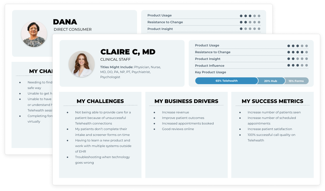
WHO ARE WE DESIGNING FOR?
For our Telehealth solution, we are most often dealing with the direct consumers in need of care, as well as the clinical staff. Often providers and their clinical staff will administer the Telehealth call.
MEASURES OF SUCCESS
We must improve the reliability and maintenance of our Telehealth offering. We need to make it more accessible for all and more inclusive. Users have requested more flexibility and control of the experience given their busy day to day. We need to make it easier to set up and join a call, which is a major painpoint of the current product.
2 pts
Increase NPS
+10%
Increase call rating/satisfaction
-10%
Decrease reported total audio/video issues
-10%
Decrease reported complexity when starting or joining calls
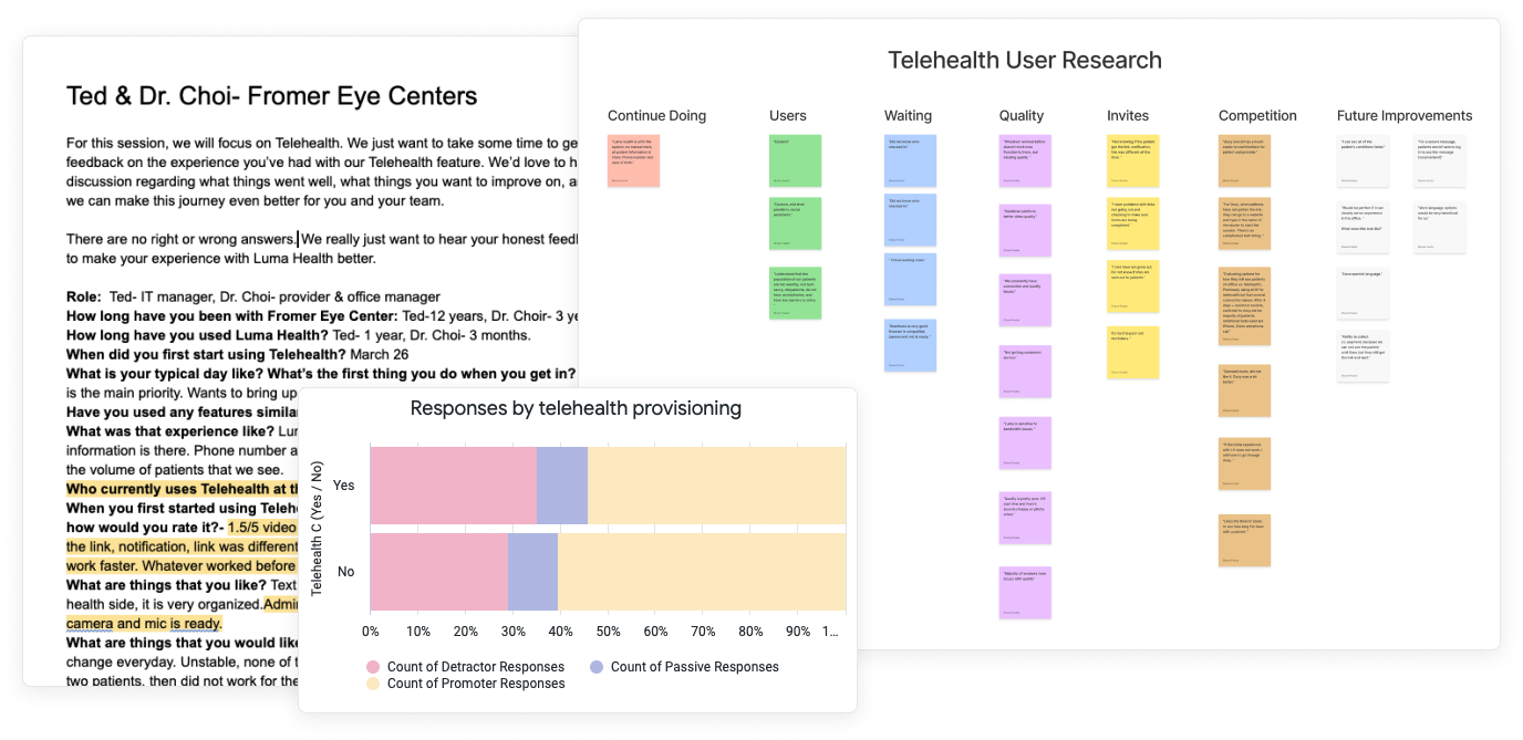
DISCOVERY
There was constant feedback that our Telehealth product had many shortcomings, however, actually identifying what these problems were was something that had not been done in detail. A lof ot the feedback was anecdotal. My first initiative is to leverage all the places I knew of to get a full picture of the problem at hand.
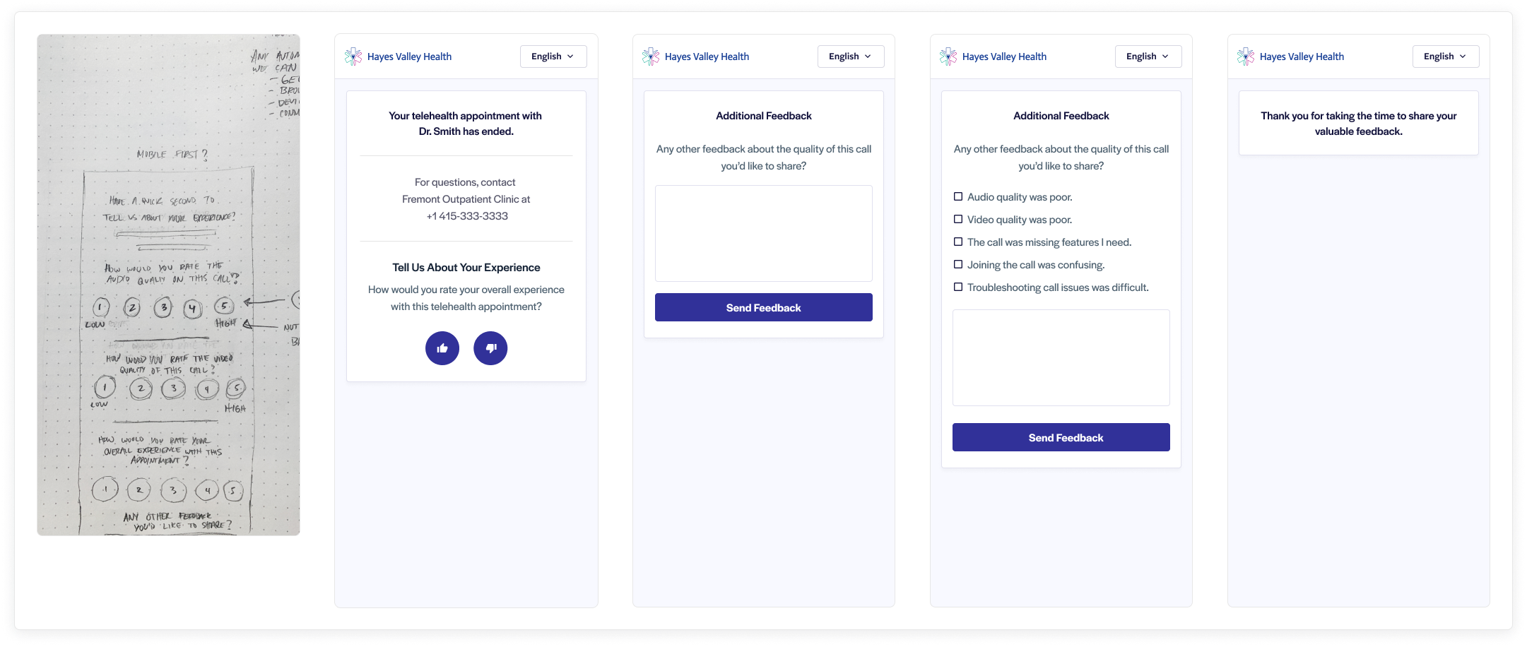
MEASURING THE EXPERIENCE
In an effort to encourage our team to focus more on outcomes than output, I designed a rating screen for our current Telehealth experience. This will give us a baseline to compare the new experience to. This was released to rate the current experience and allow us to run an A/B test between the two experiences.
AREAS OF FOCUS
Based on our research, we had a pretty good idea of where to focus to really improve the overall telehealth experience. An ehanced and updated framework was huge for performance, but patients and providers needed more.
- Simplify the starting & joining call flow
- Enhanced framework for performance (Twilio)
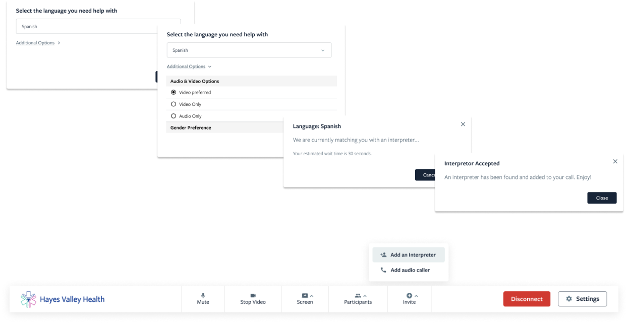
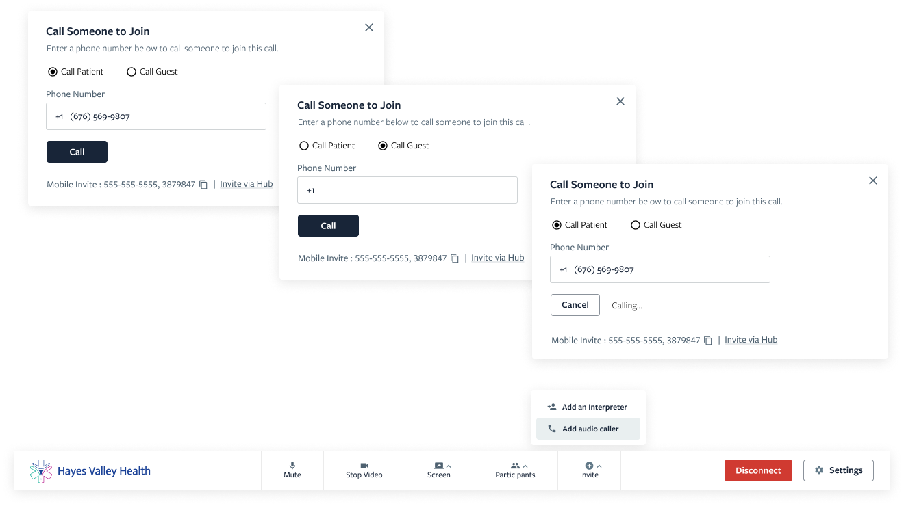
- Ability for audio calls
- Ability to add an interpreter
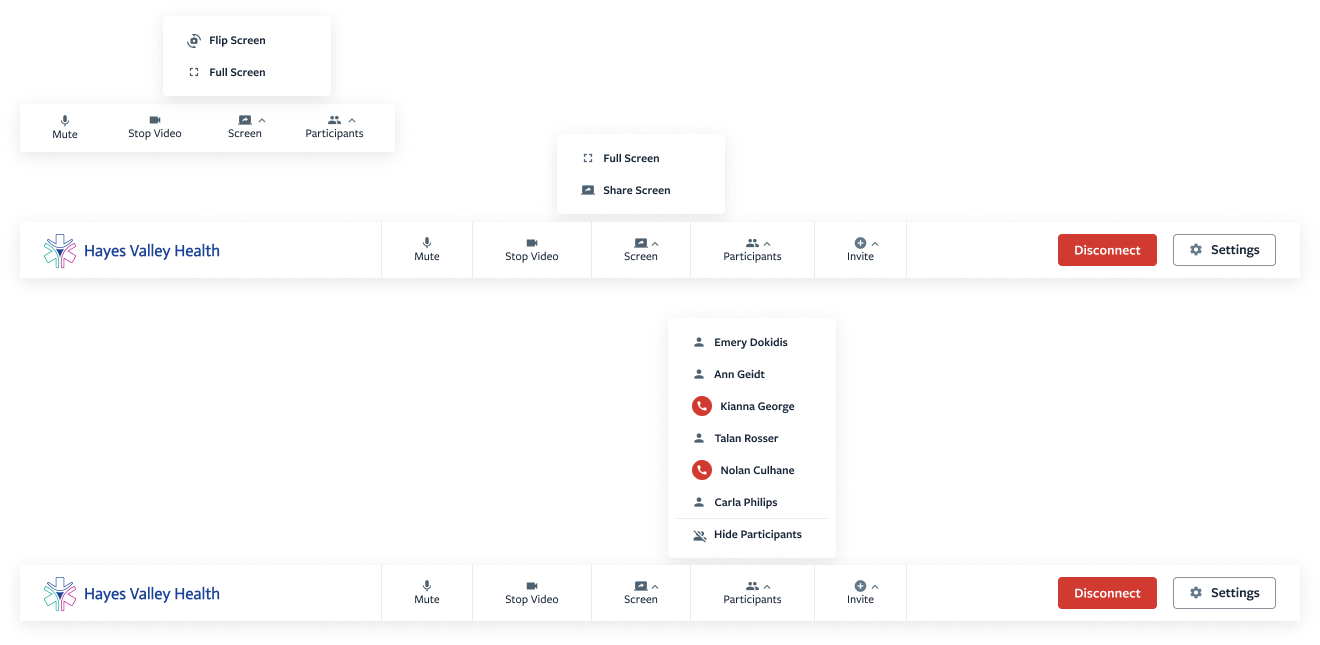
- More control of participants (hide and remove)
- Flip Screen, Sharing Screen and improved Settings
INCLUSIVE OPTIONS
We are a large platform. We have patients spread across the nation. 34% of patients on the platform do not list English as their first language. We need to design an experience that enables them access to the same care as all other languages. This is a win for our users, as well as the business, thanks to a partnership.
ACCESSIBLE FOR ALL
Not everyone has access to high quality, stable internet. Because of this, there may be technical limitations when it comes to video calls. We heard this about this a lot from our providers. When technical issues arise, they need an alternative solution to continue care.
MORE CONTROL
At times there may be multiple guests joining a call. Call administrators consistently requested more controls regarding managing participants.
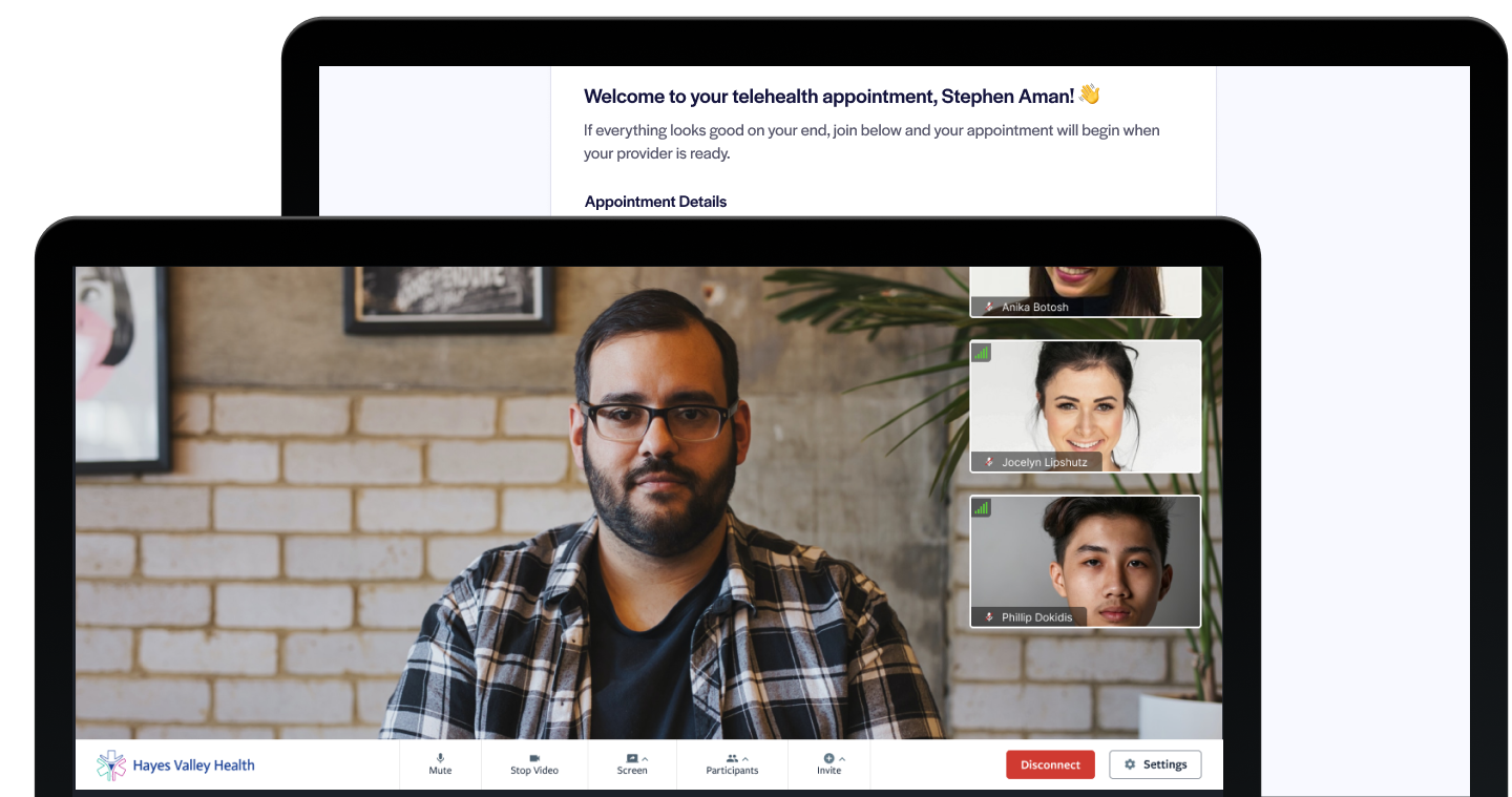
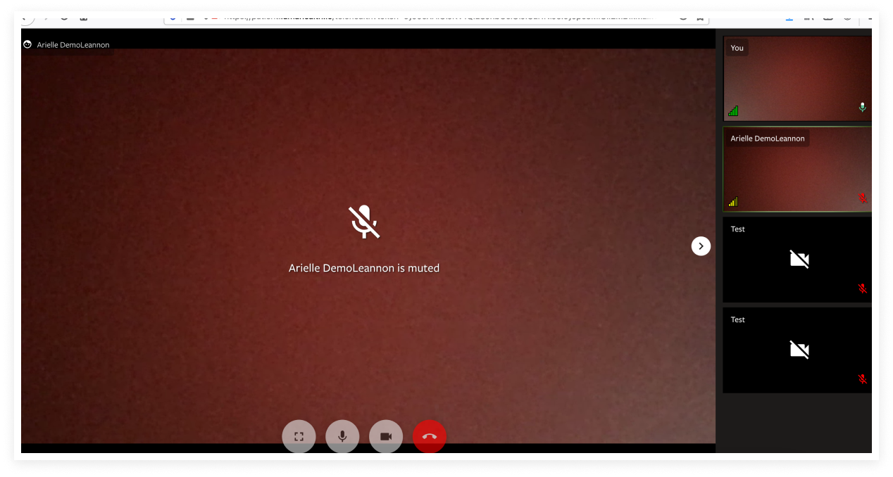
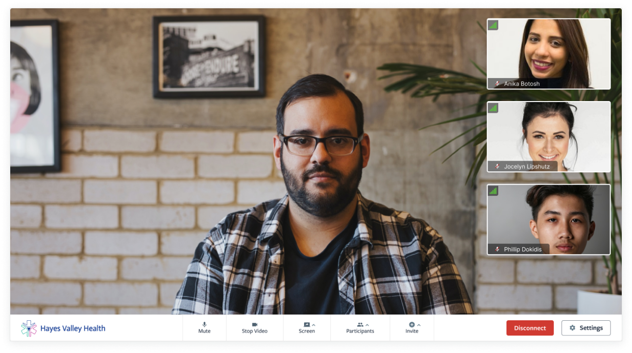
A FRESH, CLEAN LOOK
Just a little preview of the desktop view once a call has begun (all images are simply placeholders)
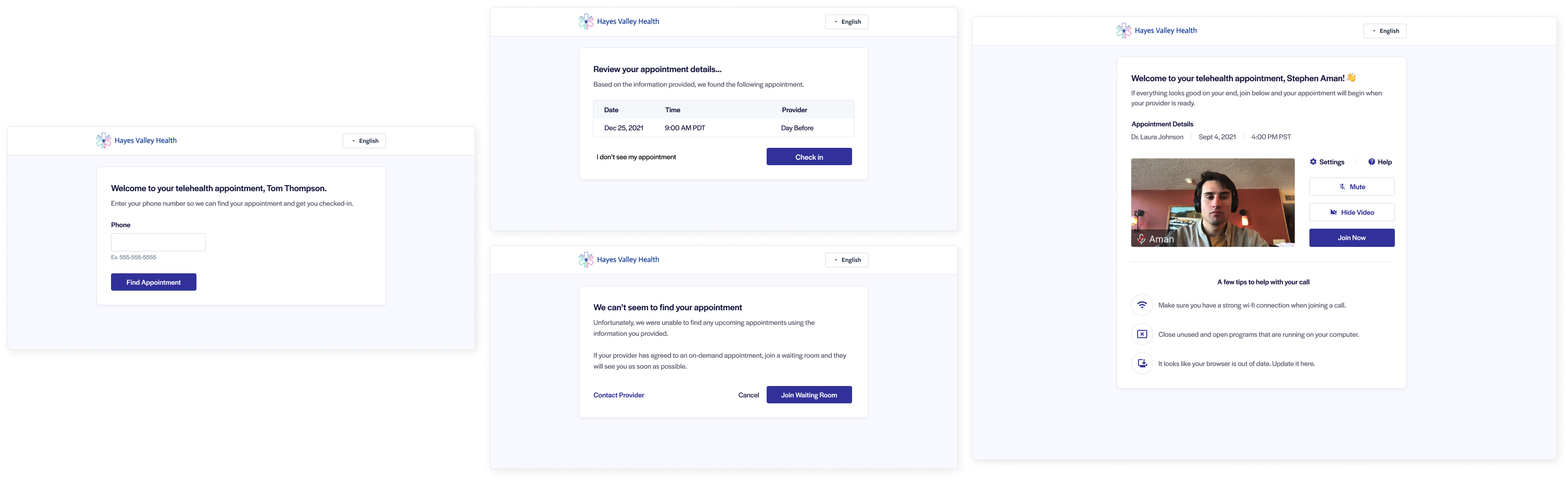
THE JOIN FLOW
We had an overwhelming amount of evidence that indicated we needed to improve the experience when joining or starting a call. We already had the infrastructure in place. We simply needed to validate if it made sense to leverage this infrastructue to make one cohesive experience that closely replicated the in-office appointment.
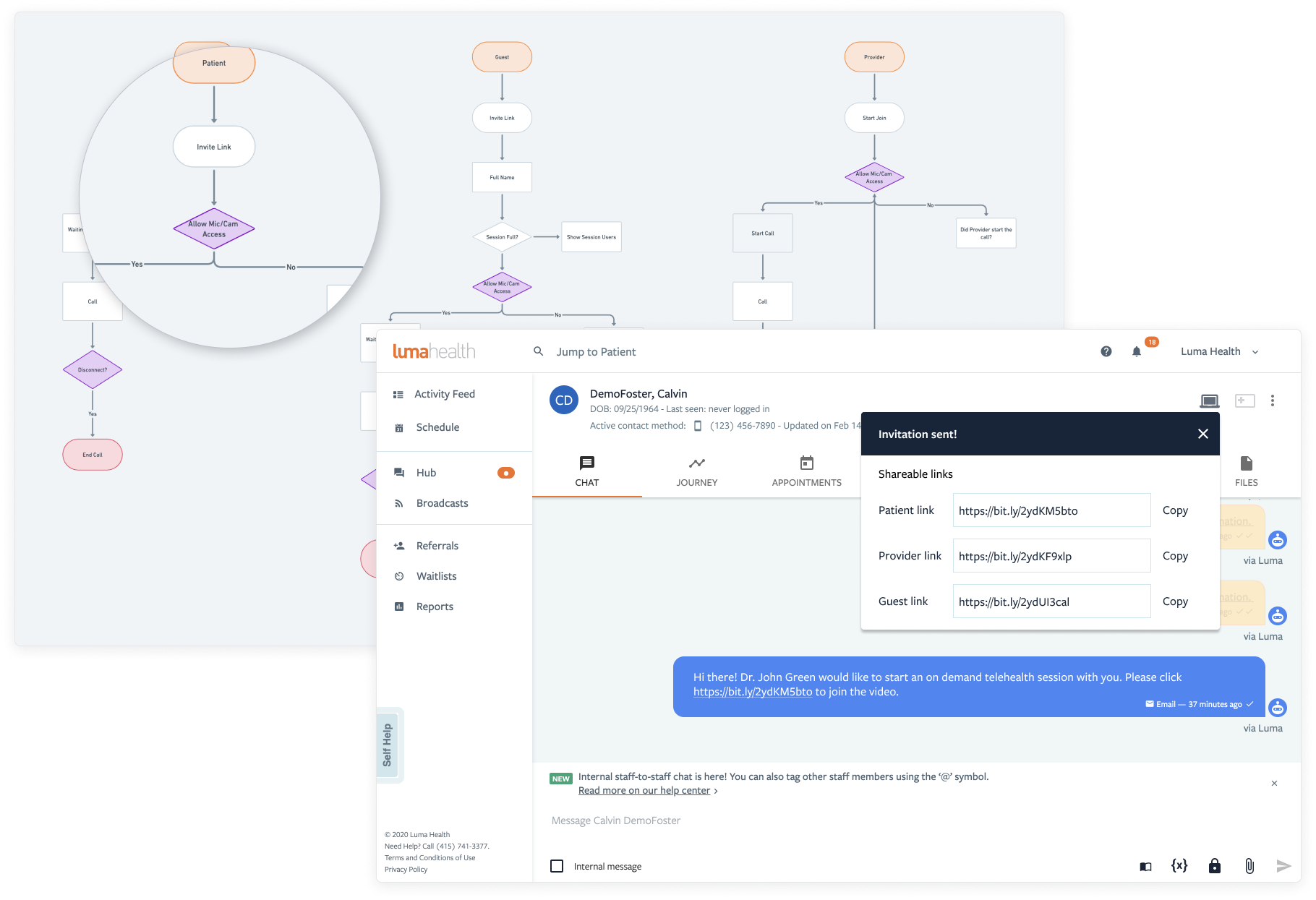
A GLOBAL LINK
The biggest pain point with the current flow were temporary links that were made for each Telehealth appointment. They were hard to track, hard to manage and created all sorts of headaches. We elminated these and created one global link that integrated with our system on the back-end. Patients now only visit one link, then "check-in" for their appointment.
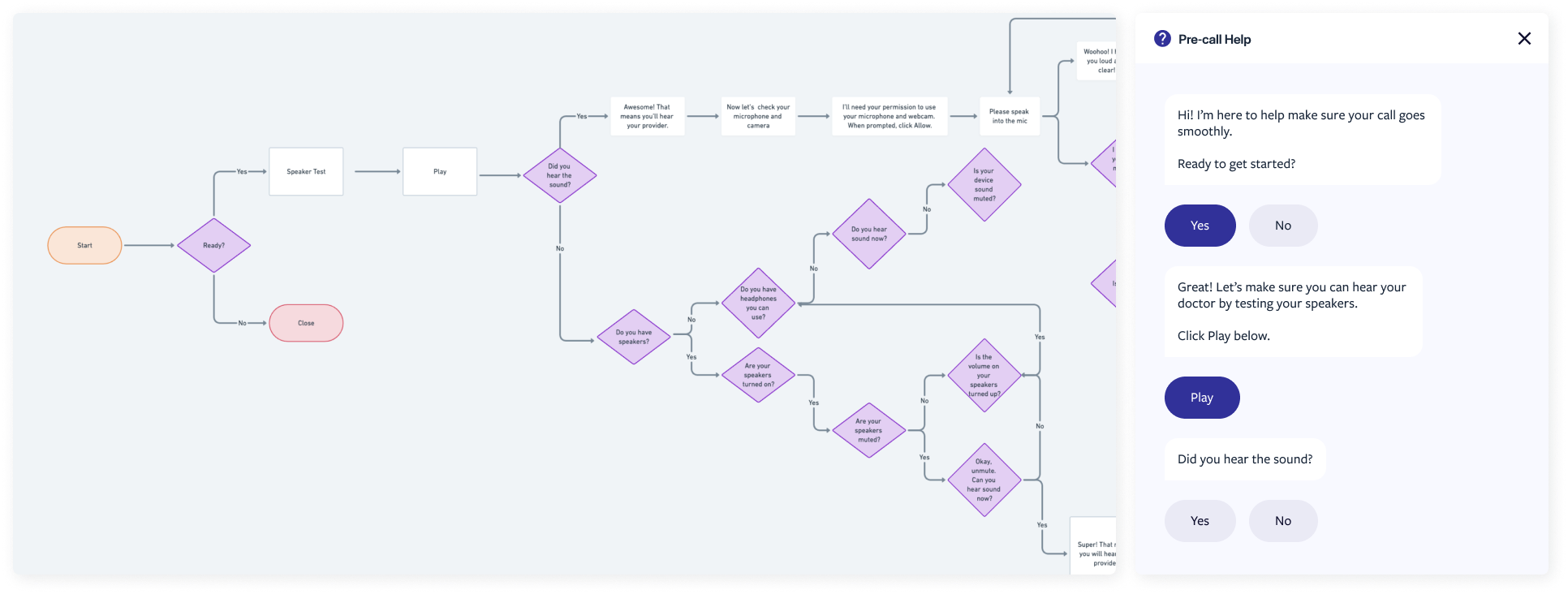
SIMPLE SUPPORT
We had recently released LumaBot, a chatbot for facilities. If a user encountered technical issues (which we saw quite often), we wanted to guide them to help resolve them. We leveraged LumaBot to create a seamless support experience.
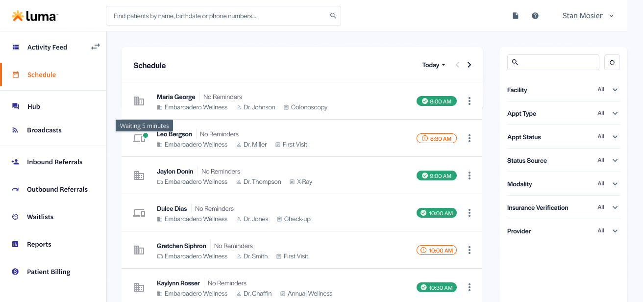
SCHEDULE INTEGRATION
As mentioned, we already have the infrastructure in place. We just need to integrate this new Telehealth flow with our existing schedule and UI. We tested and tried a few solutions and variations. We landed on something noticeable, but not too intrusive. There is also more clarity in the schedule regarding appointment types.
RESULTS
The results were pretty positive overall. We saw in increase and improvement in multiple key metrics.
+2 pts
+2 pts
Increase NPS
+10%
+12%
Increase call rating/satisfaction
-10%
-16%
Decrease reported total audio/video issues
-10%
-14%
Decrease reported complexity when starting or joining calls
WHAT WE LEARNED
- Starting small iterating, getting feedback and failing fast can lead to amazing results in the end.
- Within the healthcare space, it's very difficult to get in front of your target personas for user research and testing. That was easily the biggest challenge within this initiative.