My Role & Responsibilities
I was the product designer for the intake and clinical touchpoints (ICT) pod at Luma. This essentially means that the pod is responsible for the following features: Product Dashboard, Forms, Payments, Insurance, Waiting Room, Zero Contact, File Management and Telehealth. Many of these products are net-new and were led by myself and our pod.
- The Team (for this initiative) – Sr. Product Manager, Sr. Product Designer (Me), two front-end engineers, one back-end engineer and QA.
- Duration – 12 weeks
Background
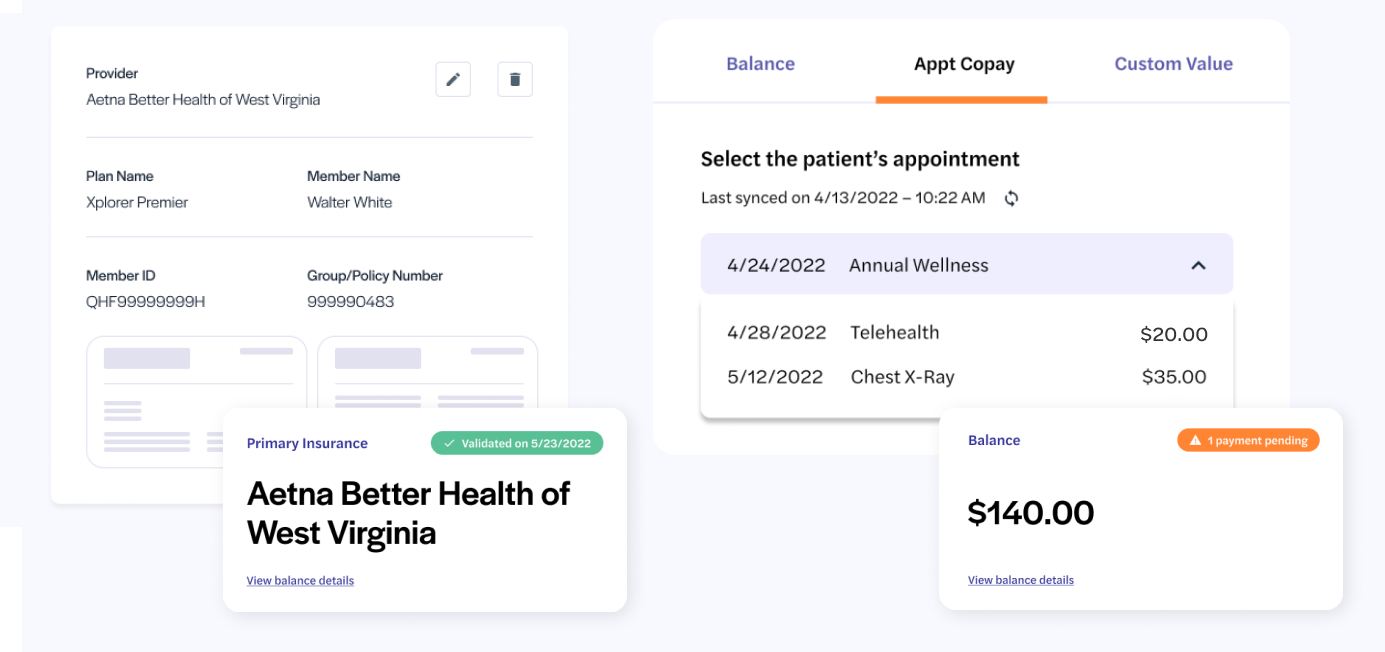
In seperate initiatives, our team had released solutions aimed at allowing for patients to upload and verify they have active insurance as well as a way for staff to request required payments related to a patient’s care.
The Opportunity
We released the ability to help patients and facilities better prepare for appointments (insurance verification & payments), but is there more we could do to improve tracking that progress and making sure we guide this journey to make for a more efficient experience?
- How might we make the appointment check-in process more efficient for facilities?
- How might we help patients understand what is needed for a successful appointment?
Personas
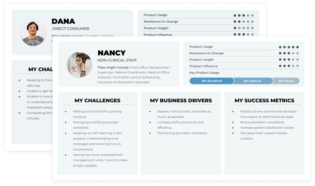
For this experience, we would need to both focus on the patient, as well as the front desk staff that typically manages the appointments and the office schedule.
Measures of Success
How can we do a better job knowing if a patient and staff are both prepared for an upcoming appointment? What does success look like?
x Mins.
Decrease appt. check-in time.
+10%
Increase pre-appointment form completion rates
+10%
Increase pre-appointment insurance verification rates (business value)
+5%
Completed Copays (business value)
Qantitative Discovery
I leveraged our product analytics tools to assess user behavior in the areas we were looking to focus. Because this initiative revolves around appointments, the it made sense to focus on the Schedule experience.
Key Insights
- /Schedule and /Hub (Chat) are our most visited pages by far
- The most visited path from the Schedule is a patient’s individual Profile and Files, tab which contains forms and insurance information
- The Filters on the Schedule page are heavily used (40% of all page clicks)
- Users mostly engaged with filters are around appointment confirmation/status
- The date picker was heavily interacted with, allowing users to prepare for future appointments

Qaulitative Discovery
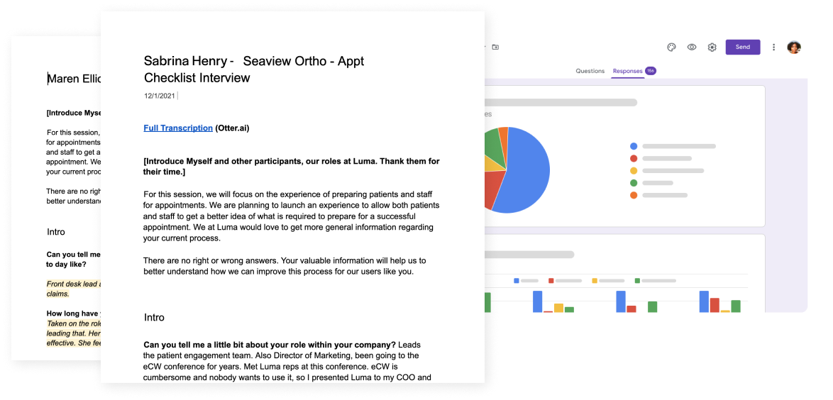
To provide a successful solution we must first understand how facilities currently prepare patients for appointments. Who generally handles this process? When is it usually done? What information is most important to them? What are their pain points? Do they even use Luma for this?
Key Insights
- The average time spent checking patients in is 3-4 minutes (depending on what they have completed prior to the appointment). If incomplete forms, even longer.
- Insurance, necessary forms and co-pays are the most required items for most appointments.
- Staff usually check the schedule the day of but would do it earlier if the process was easier.
- Traditionally, it’s a very manual process to gather a lot of necessary appointment details (phone calls, in-person conversations).
- There is often a separate billing department that handles co-pays and insurance (if there are issues).
Current Experience
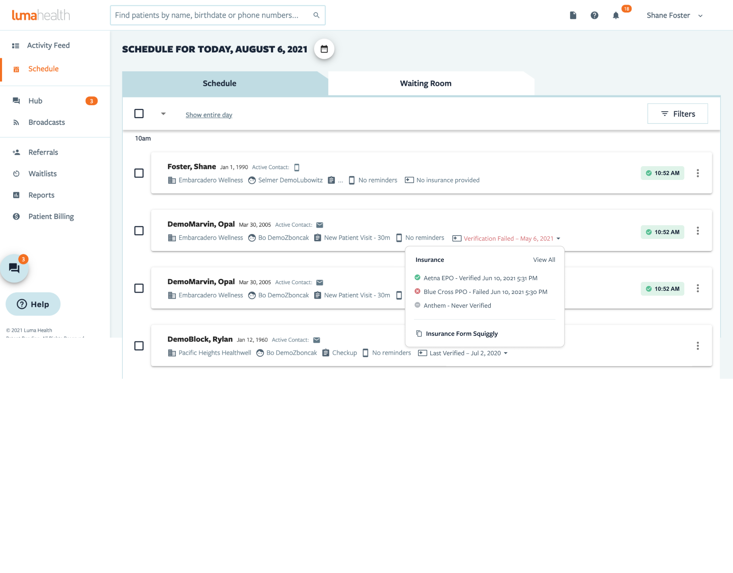
We have an existing schedule page that facilities used to manage their upcoming appointments. We already included the ability to check insurance verification status. How can we continue to add value here?
Exploration
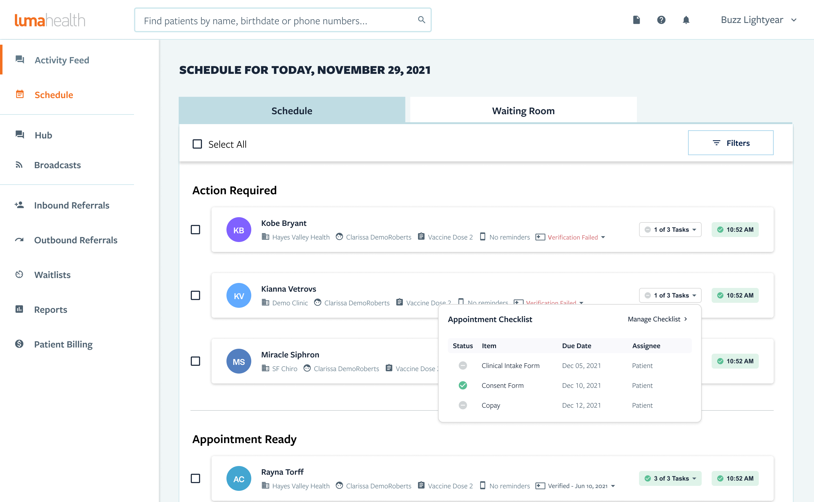
I tested splitting the schedule into sections, one for appointments that need action vs those that don’t. I also attempted to show items that need attention. However, I had an assumption we were conforming to our current schedule design too much.
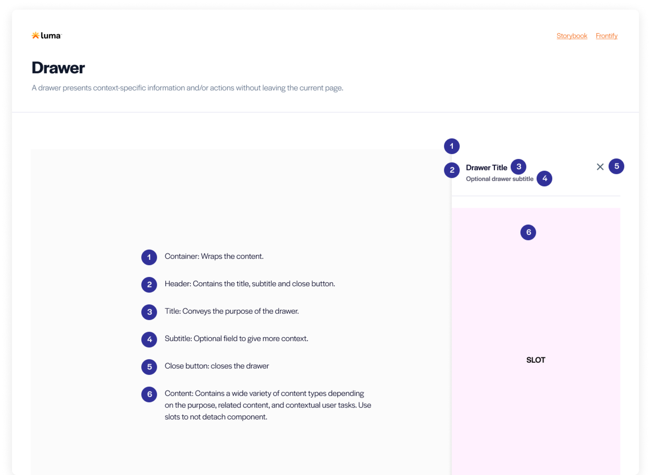
Drawer Pattern
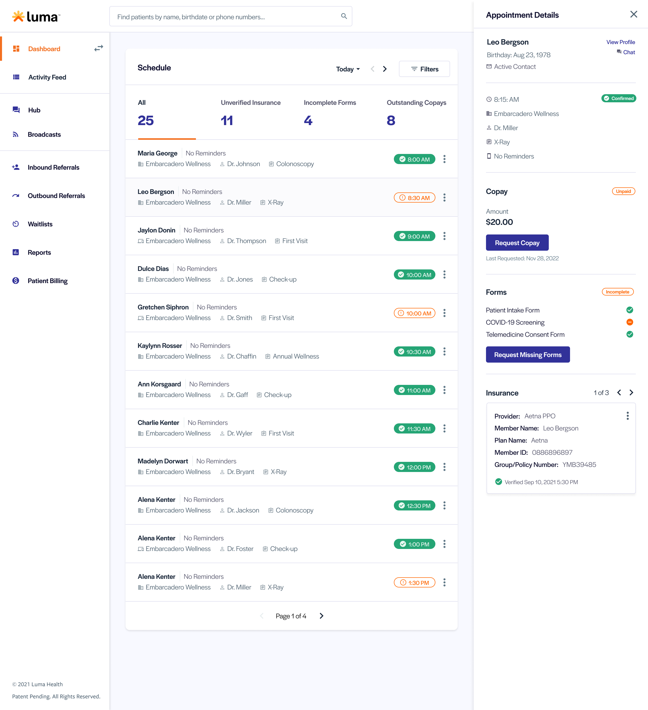
Introducing a new pattern could give users more power to take action on specific tasks while staying in the context of their current flow.
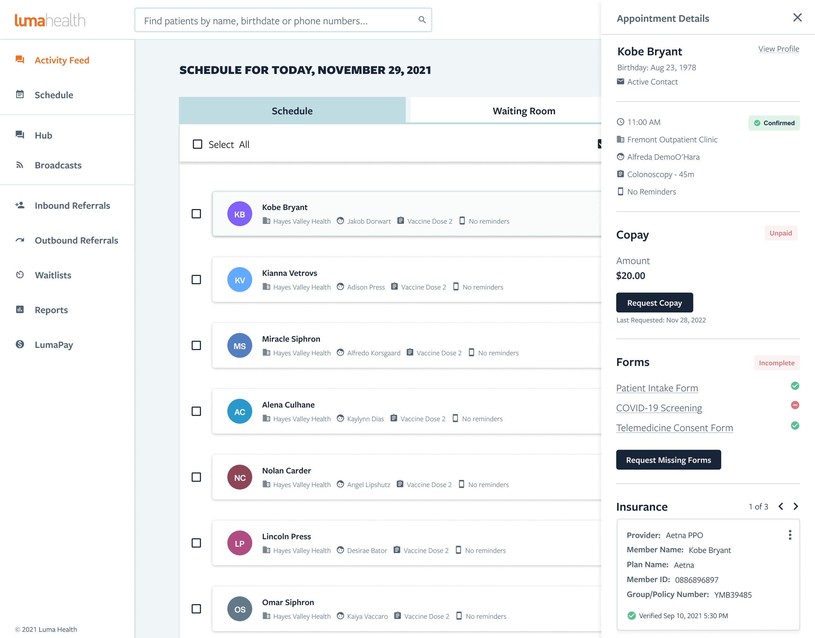
More Flexibility
Users had trouble with so many buttons/options. The user still had to go outside of the schedule to take action or manage the checklist. Many of these elements determine if a patient is ready for an appointment. There is an opportunity to make this relationship stronger.
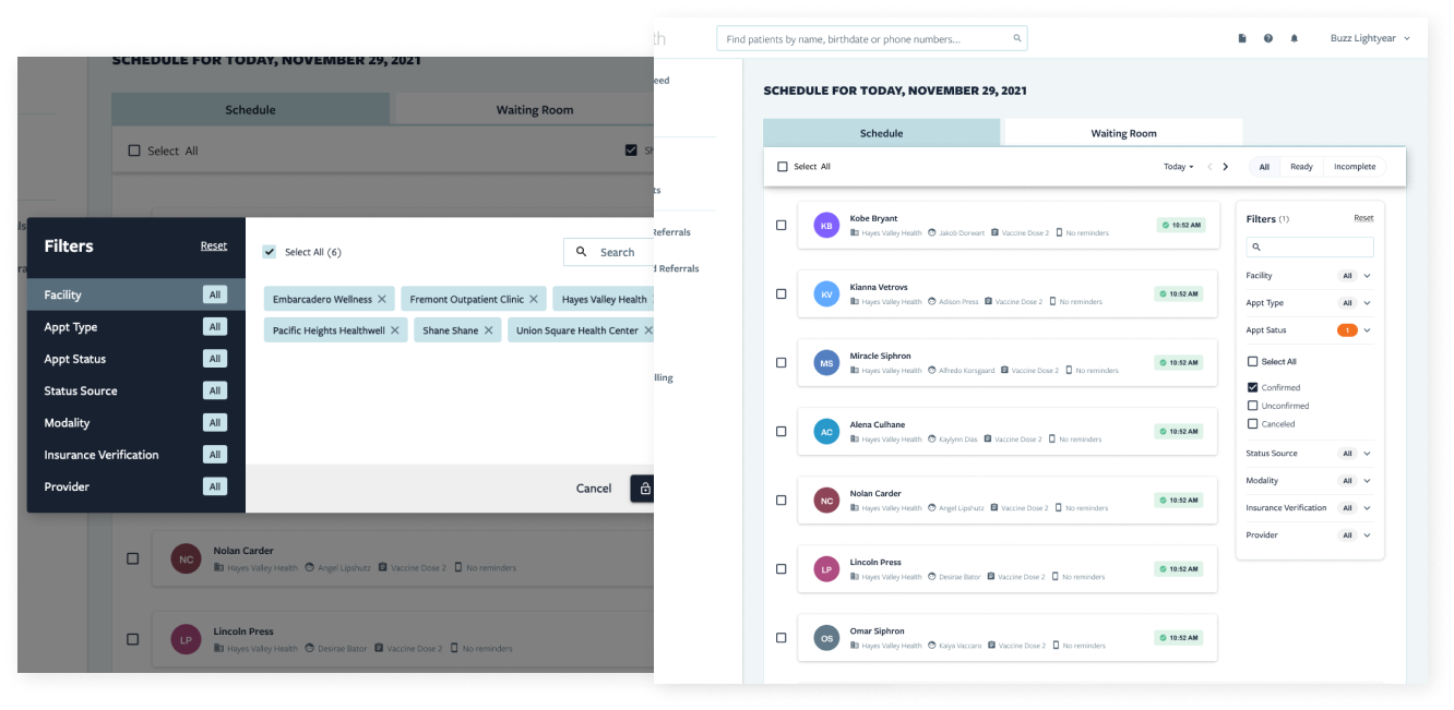
Guiding Actions
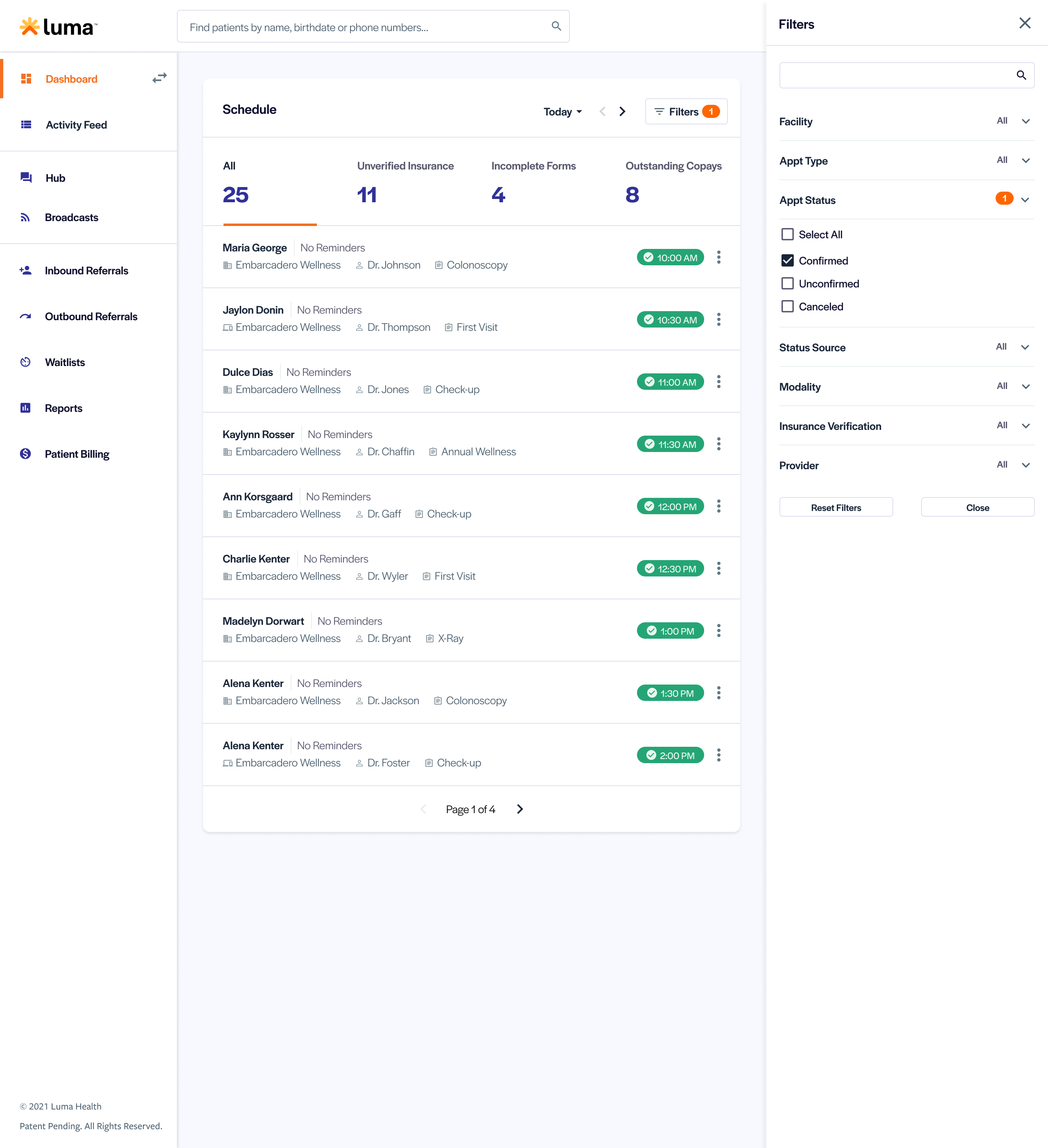
We made improvements to help a user know where to take action once they find a specific appointment, however, we need to better guide them to find those appointments. Our quantiative analysis showed that the filters on the schedule are heavily used, but is it for good reason? In speaking with users and watching session replays, we were able to analyze feature usage and make improvements.
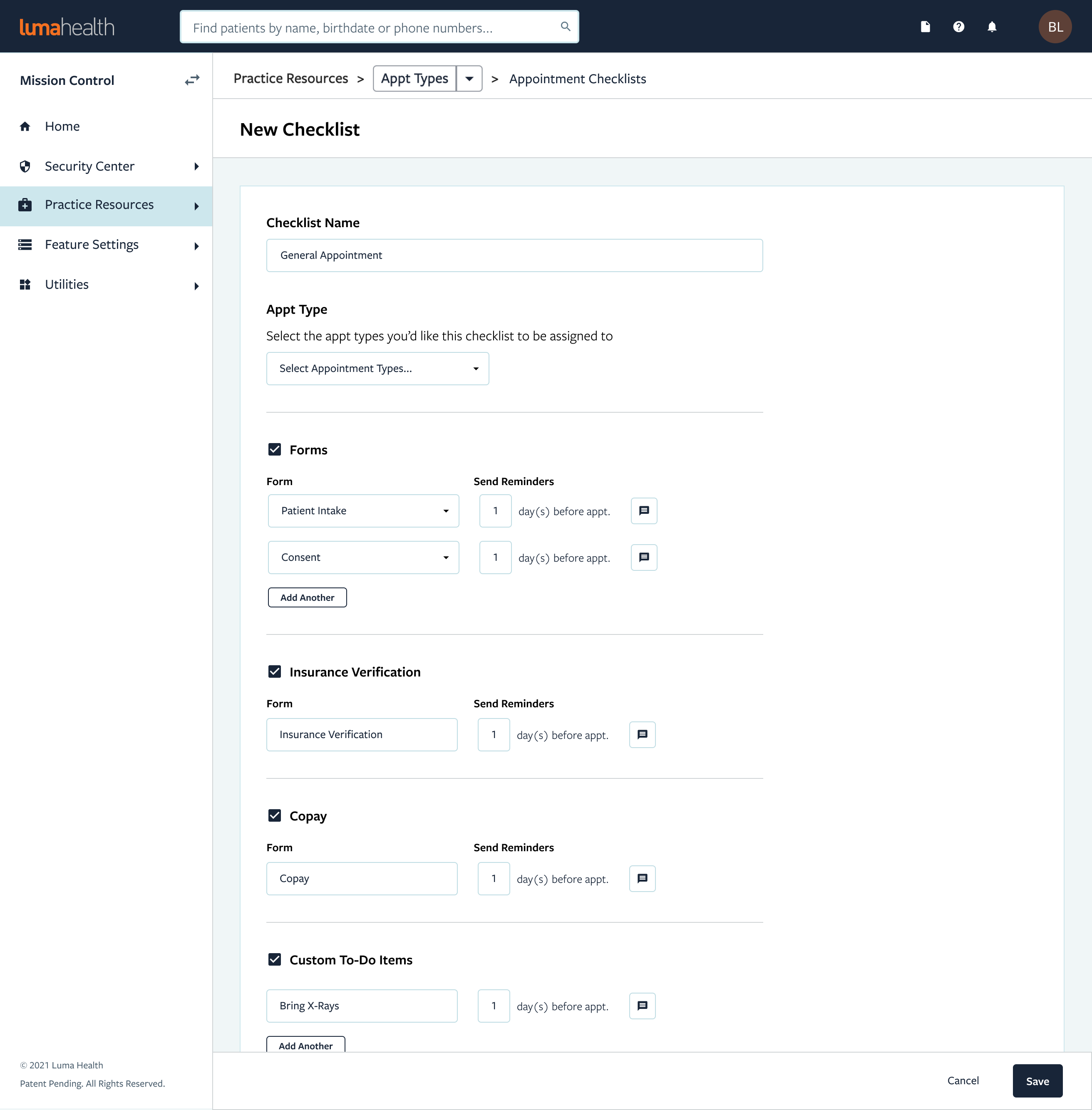
Managing Requirements
Not all facilities operate the same. Just as there are various types of appointments and requirements for those appointments. We needed to add more control within each appointment type.
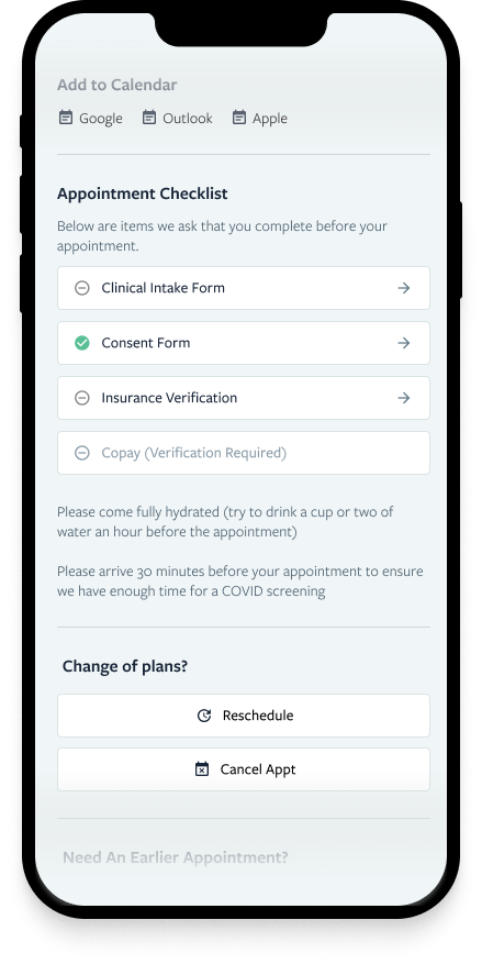
Patient Visibility
There was an opportunity on the patient side to expose them to the checklist experience. Adding this to a new appointment confirmation page allows the patient to get a better understanding of what’s required of them as a whole.
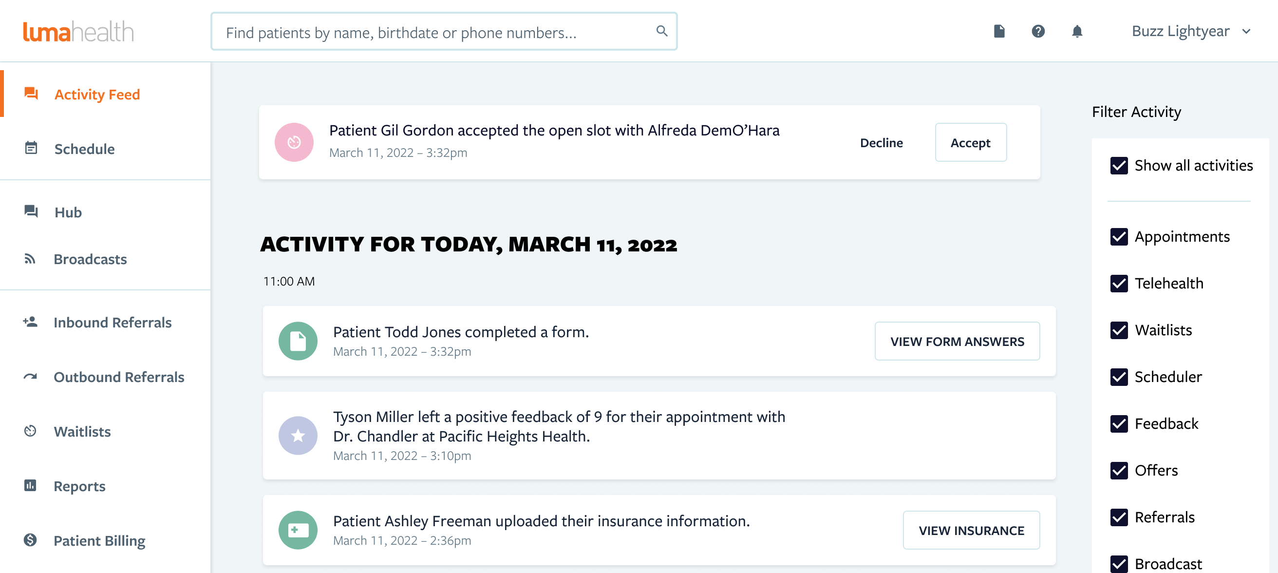
Taking it a Step Further
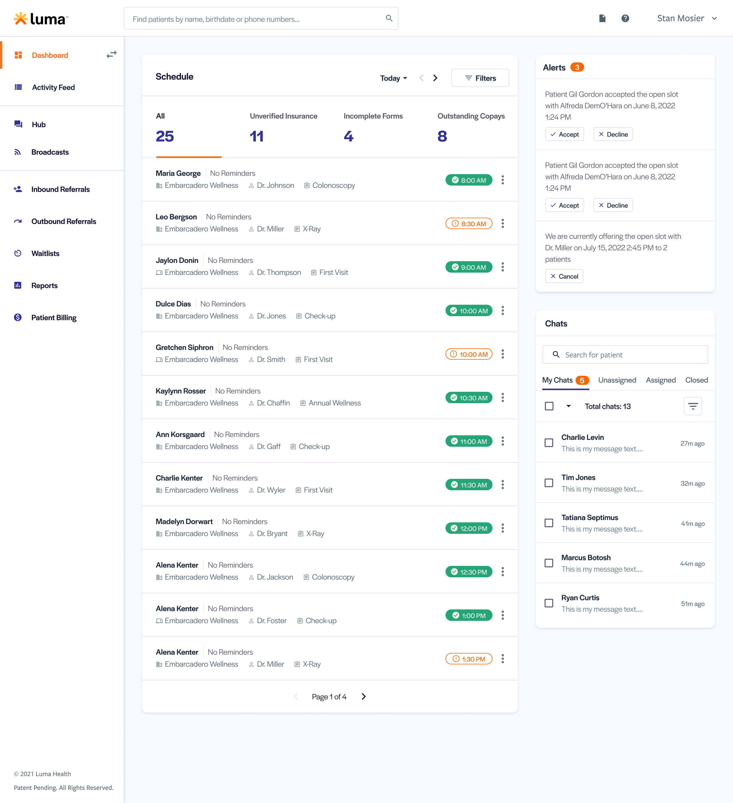
Our current app “landing page” is an activity feed that shows different actions occurring within a practice. Our analytics showed the page was not heavily interacted with. Qualatative information from our user interviews implied the page may not be providing the value it could for the initial app experience.
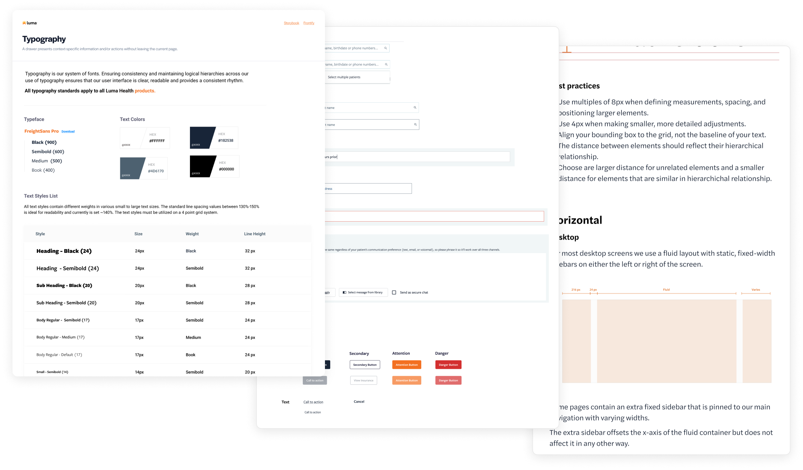
Design System
While pushing this initiative forward, Luma Health was also undergoing a rebrand. The rebrand was marketing-led, but was going to also touch the product. Thanks to the work we initially did in creating a product design system, it made our path forward so much easier when it came to making updates and understanding how those updates will affect the product.
Bringing it All Together
The final design was a culmination of hours of research and user testing. It combined multiple improvements from the Schedule from earlier screens and replaced it. It also surfaced other highly engaging features like our Hub chats, while quickly showing facility staff where they need to take action and why.
Results
The results were pretty positive overall. We saw in increase and improvement in multiple key metrics.
10%
16%
Increase pre-appointment form completion rates (82%)
10%
14%
Increase pre-appointment insurance verification rates (business value)
5%
3%
Completed pre-appointment Copays (business value)
- x Mins.
Decrease appt. check-in time.
What We Learned
- Starting small iterating, getting feedback and failing fast can lead to amazing results in the end.
- Within the healthcare space, it's very difficult to get in front of your target personas for user research and testing. That was easily the biggest challenge within this initiative.